

How Box Color Design Impacts Your Brand
Discover how packaging color influences brand perception, consumer behavior, and sales. Learn the best box color designs for every industry.
Contact Us now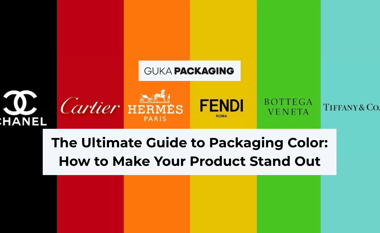
Table of content
Ready to Elevate Your Brand with 100% Custom Box & Bag Solutions?
Get a Free QuoteIn the world of product packaging, color is more than decoration — it’s a strategic tool. Studies show that color can influence 67% of a consumer’s first impression within just 7 seconds. The right packaging color can make your product instantly recognizable, communicate your brand values, and even drive purchasing decisions.
At GUKA Packaging, we help brands in the U.S., Europe, and Australia craft custom rigid boxes, folding cartons, and paper packaging that leverage color to attract, engage, and convert customers across industries such as cosmetics, food, jewelry, electronics, and more.
Why Packaging Color Matters
1. Packaging Color as Brand DNA
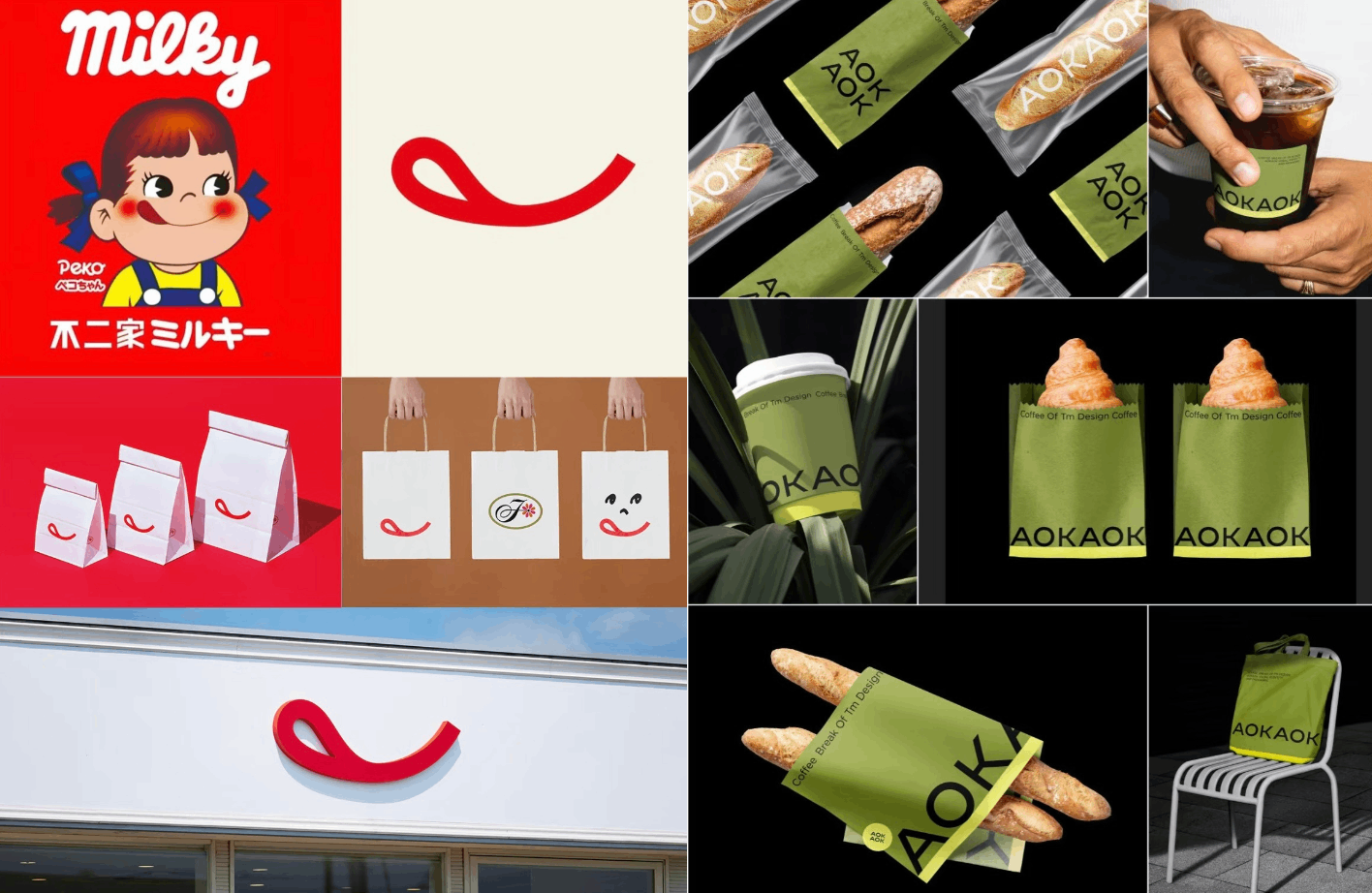
Color is one of the fastest ways to capture attention and communicate your brand’s personality. Some colors are so strongly associated with a brand that they become iconic:
- Hermès Orange → Luxury, exclusivity, and boldness.
- Tiffany Blue → Romance, trust, and timeless elegance.
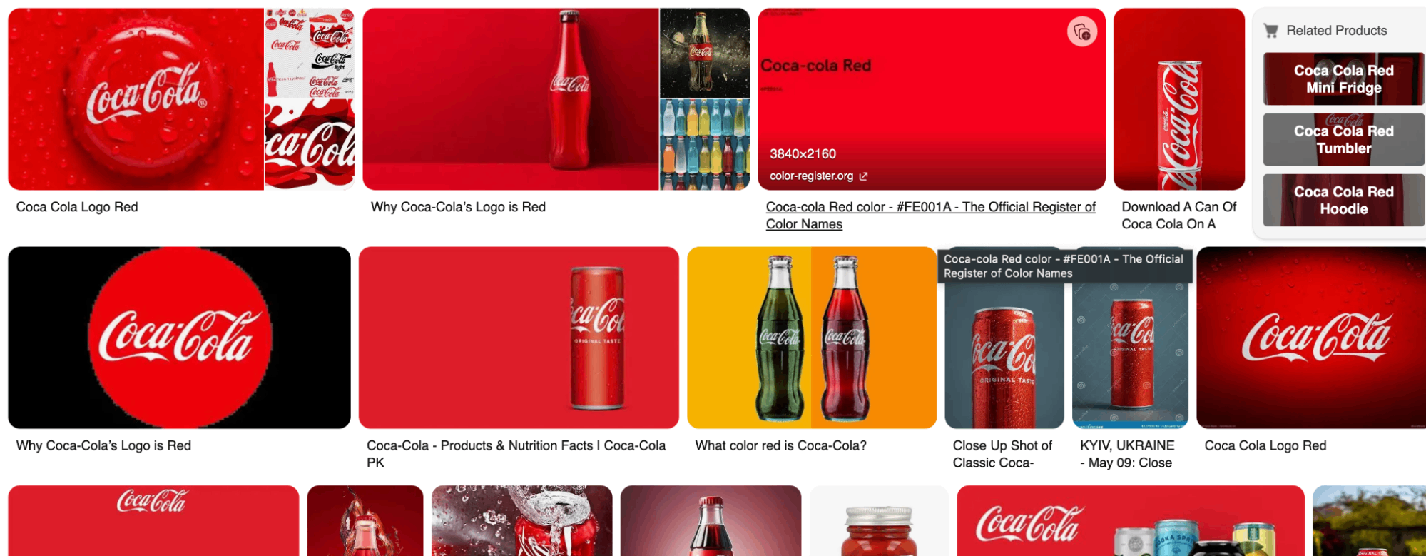
- Coca-Cola Red → Energy, youthfulness, and joy.
By choosing the right brand color, your packaging becomes a visual shorthand for your brand’s identity, making it instantly recognizable on shelves or online.
2. Color Attracts Consumer Attention
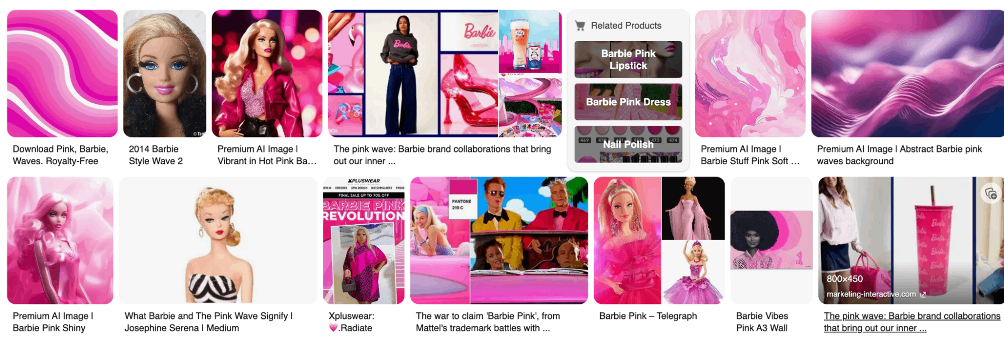
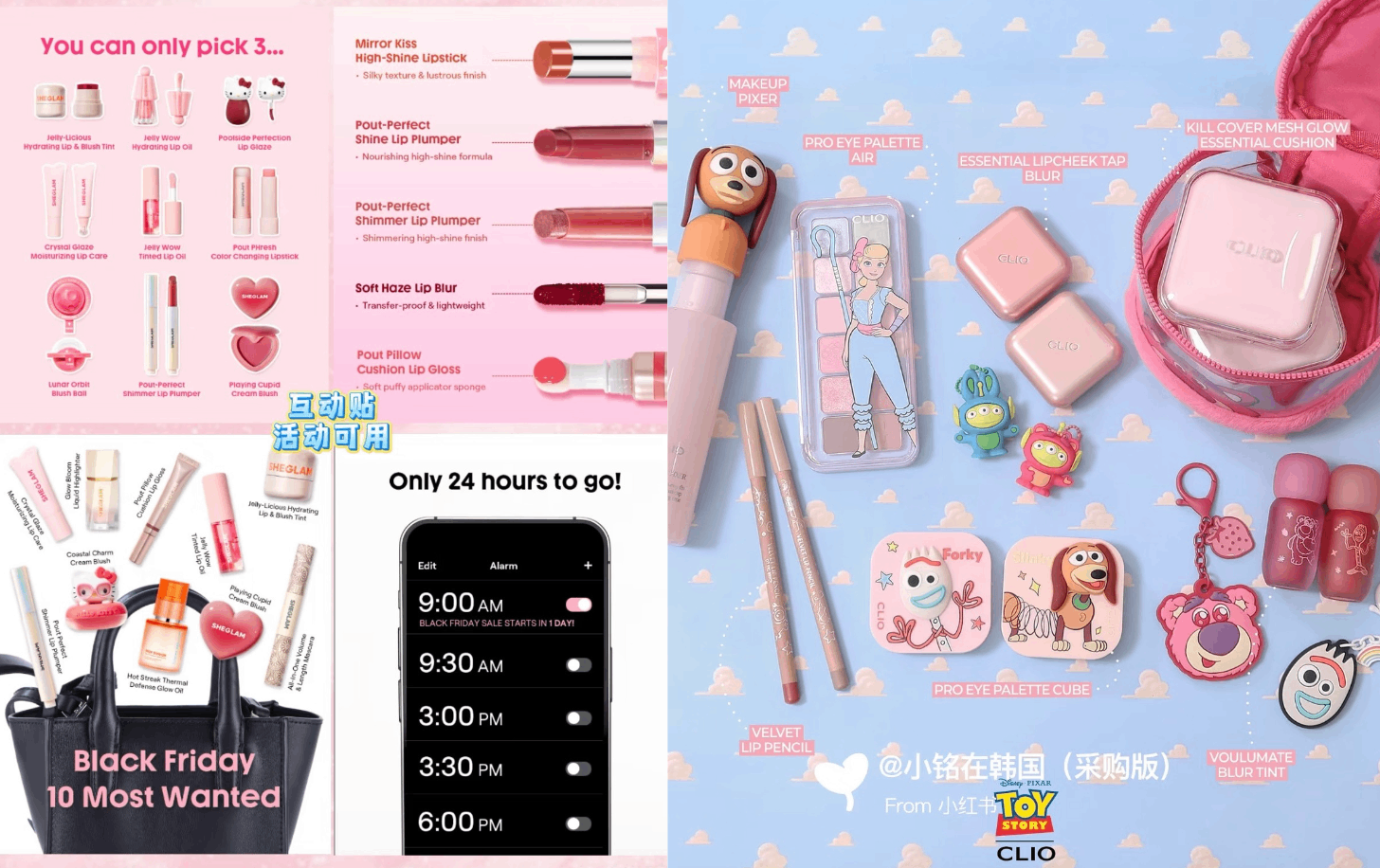
In today’s fast-paced market, products have mere seconds to capture interest. Using attractive colors can boost visibility and make customers stop to explore your product. Seasonal or limited-edition color packaging also drives engagement, like Barbie pink collaborations for beverages or collectible products.
3. Colors Convey Product Attributes
Each color evokes specific emotions and associations, helping communicate your product’s personality:
- Red → Passion, excitement, appetite stimulation (great for food packaging).
- Blue → Calm, trust, professionalism.
- Green → Health, nature, eco-friendliness.
- Orange → Warmth, sweetness, energy.
- Purple → Luxury, mystery, elegance.
- White → Cleanliness, minimalism, purity.
- Black → Sophistication, authority, premium quality.
Choosing suitable colors for your packaging ensures that your product messaging aligns with your brand promise.
Color Marketing — The Art of Building a Stand-Out Brand
When we think about a brand, the logo often comes to mind first.
But sometimes, a single color is enough for us to instantly recall a brand — that’s the power of the “brand color.”
When a color becomes part of a brand’s DNA, it’s no longer just a design choice — it’s a core identity. This is why color marketing plays such an important role in building brand recognition and emotional connection.
What is Color Marketing?
As the theory of color marketing suggests:
"Within just 7 seconds, consumers form their first impression of a product’s appearance — and color accounts for 67% of that impression."
If a brand neglects the visual design of its products, it’s not just missing attention — it’s missing the biggest opportunity to win customers.
Use those 7 seconds well, and the impact multiplies.
Recent examples prove this point:
- Dopamine color schemes that went viral on TikTok in the summer of 2023
- The “Barbie pink” wave after the Barbie movie release
- The “Merlot-inspired” autumn palettes that dominated seasonal marketing
These show that colors can fuel not only pop culture but also ongoing brand engagement.
Packaging Color Psychology by Industry
Food & Beverage
- Red and Green dominate — red stimulates appetite, green signals health and organic qualities.
- Example: Many snack and beverage brands use red to create excitement and urgency, while premium teas often adopt green packaging to emphasize natural ingredients.
Beauty & Cosmetics
- Colors often reflect the target audience:
- Pastels and pinks → Female-focused products
- Bold or dark shades → Male-focused or unisex products
- Ingredient-driven colors like black for charcoal masks or green for herbal products can communicate efficacy visually.
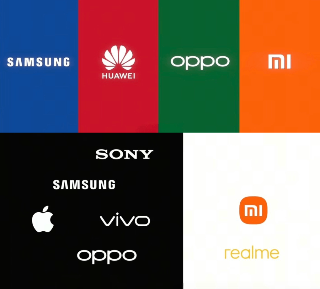
Electronics
- Neutral shades like black, white, and gray convey sophistication.
- Vibrant or metallic shades indicate innovation and trendiness, especially for younger audiences.
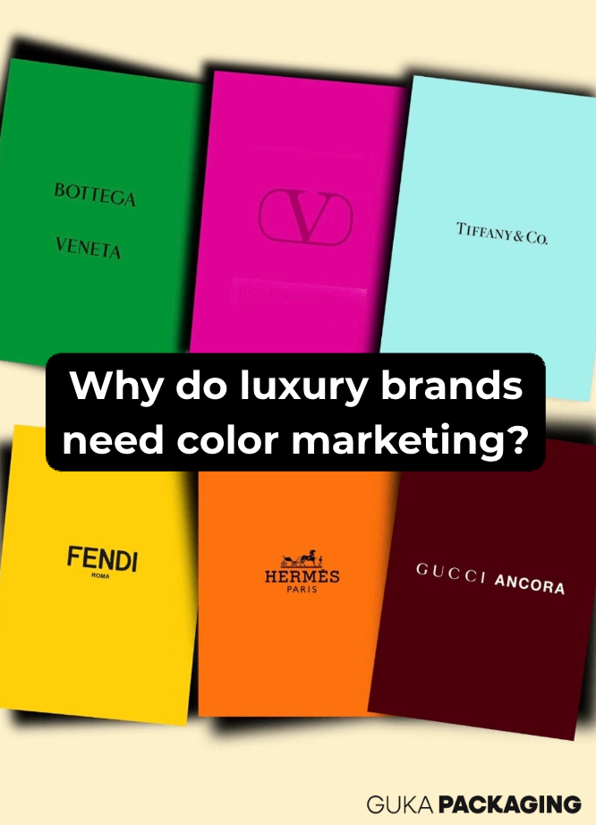
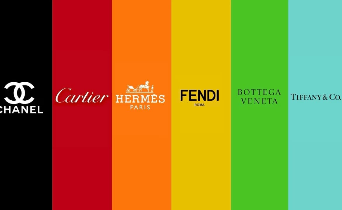
Luxury Products
- Signature colors (e.g., Tiffany Blue, Hermès Orange) communicate exclusivity and premium value.
Best Practices for Choosing Packaging Colors
- Consider Brand Positioning – Luxury brands may benefit from black or white packaging, while playful products can leverage bold, bright colors.
- Understand Customer Desires – Align colors with your target audience’s expectations (e.g., green for eco-conscious buyers).
- Cultural Impact – Colors carry different meanings across regions; research your target market to avoid misinterpretation.
- Product Messaging – Use hues that reinforce your product theme: pastels for trendy items, earthy tones for sustainable goods.
- Test Color Combinations – Harmonious packaging color schemes can enhance aesthetics and readability.
Colorful Packaging Design Tips
- Use contrasting colors for text and backgrounds to improve legibility.
- Highlight call-to-action areas with bold, most attractive colors for advertising.
- Incorporate colored squares on packaging to signal product features or categories.
- Experiment with seasonal or limited-edition colors to spark excitement and urgency.
Successful Brand Color Examples
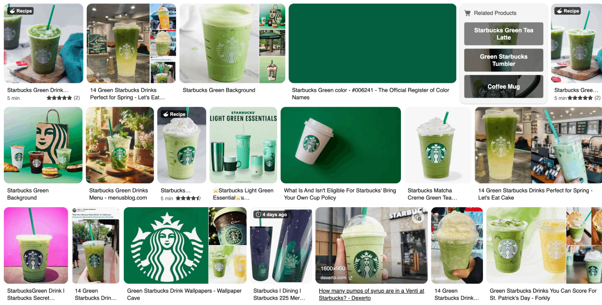
- Starbucks Green → Calming, inviting, and unique for a coffee brand.
- Coca-Cola Red → Bright, warm, instantly recognizable, symbolizing energy and youth.
- Tiffany Blue → Emotional connection, premium perception, and trademarked brand identity.
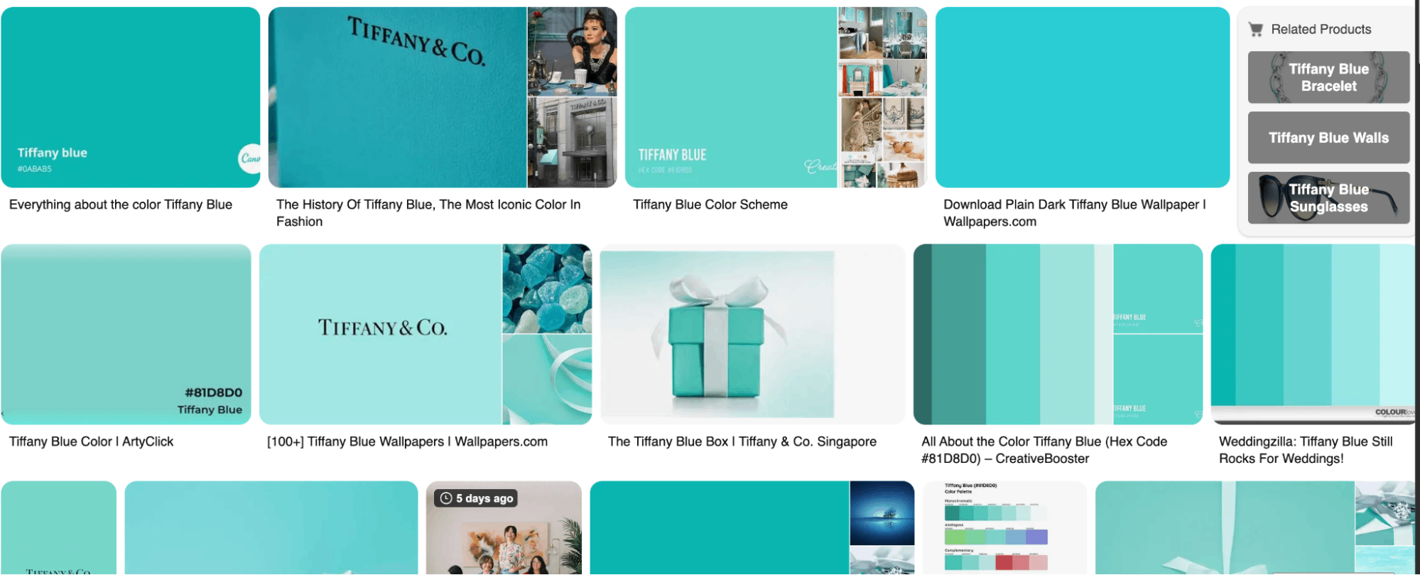
These examples demonstrate how strategic color choices can differentiate products, evoke emotions, and strengthen brand recognition.
How GUKA Packaging Can Help
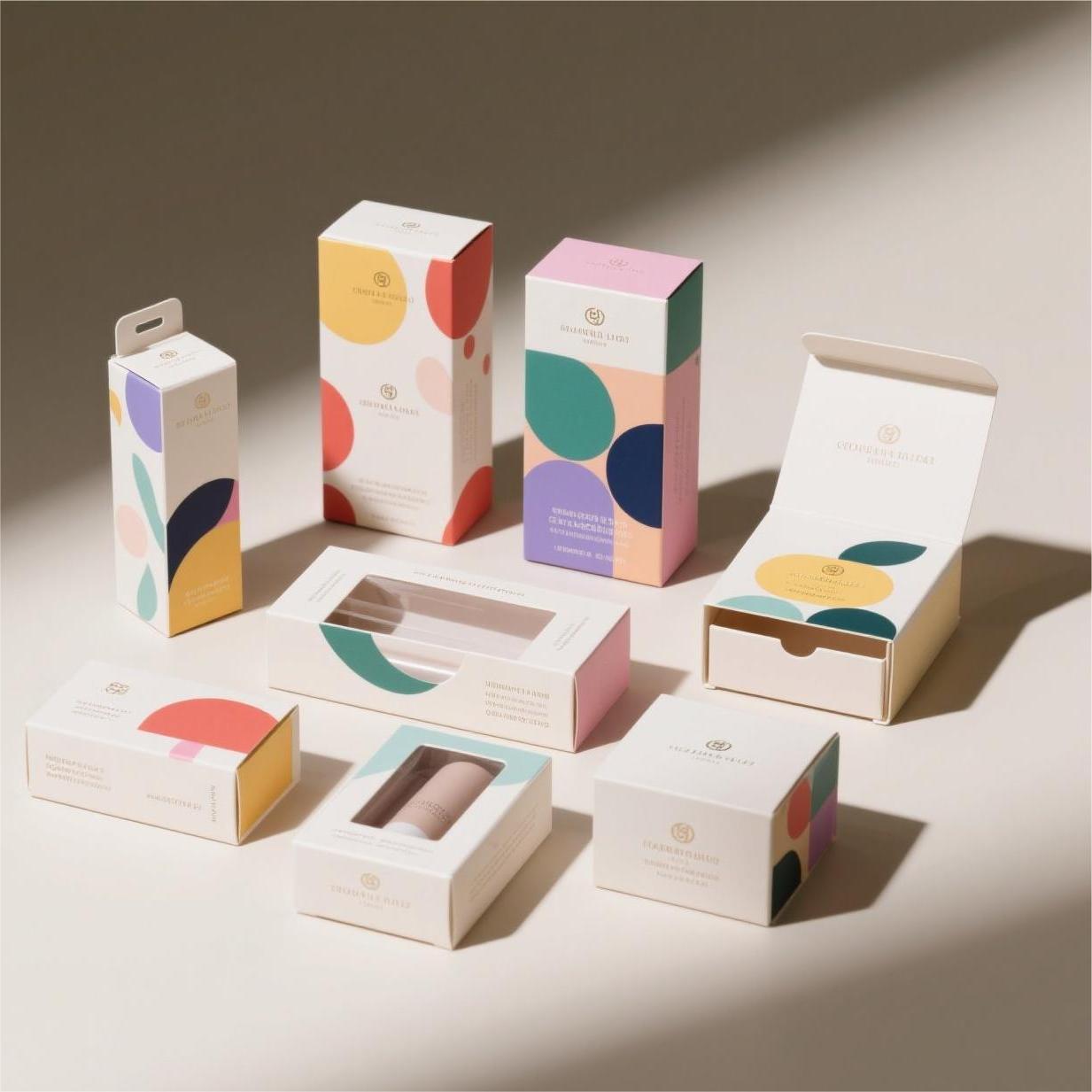
At GUKA Packaging, we specialize in creating custom rigid boxes, folding cartons, corrugated boxes, and stylish paper bags that leverage color to enhance your brand:
- Tailor colors to your brand DNA and product attributes.
- Produce high-quality printing and finishing that make your packaging pop.
- Offer flexible solutions for luxury, food, cosmetics, electronics, and more.
- Ensure your packaging colors are culturally appropriate for U.S., European, and Australian markets.
Whether you want a white colour box, bold black packaging, or vibrant multi-color designs, GUKA Packaging can bring your brand’s vision to life.
Partner with GUKA Packaging Now
Color is more than decoration — it’s a tool that influences perception, drives sales, and builds lasting brand recognition. From food and cosmetics to luxury and electronics, the right packaging color can make your product irresistible.
Partner with GUKA Packaging to design custom boxes and packaging that captivate your audience, reflect your brand values, and stand out on the shelves. Start your project today and see your colors come to life!
Frequently Asked Questions (FAQs) About Packaging Color and Box Color Design
1. Why is packaging color important for my product?
Packaging color influences first impressions, attracts attention, and can shape consumer perception of your product’s quality, style, and value. Strategic color selection can enhance brand recognition and drive sales.
2. How do I choose the most suitable color for my packaging?
Consider your brand identity, target audience, product type, and industry trends. Use color psychology to evoke the right emotions and align the color with your product attributes, whether it’s luxury, eco-friendly, playful, or premium.
3. What are the best colors for food packaging?
Colors like red, orange, green, and yellow are often effective in food packaging. Red stimulates appetite, green suggests health and freshness, yellow conveys cheerfulness, and orange sparks excitement—perfect for snacks or beverages.
4. How do box color design and packaging color schemes affect consumer behavior?
A well-planned color scheme can guide attention, communicate product purpose, and create emotional connections. Complementary or contrasting colors help products stand out on shelves and make packaging more memorable.
5. Can a white colour box be effective for my brand?
Yes! White is associated with cleanliness, simplicity, and elegance. It works particularly well for skincare, tech, wellness, and premium products, giving a minimalist and modern feel.
6. What role does black packaging play in branding?
Black conveys luxury, sophistication, and exclusivity. Many high-end brands use black boxes or packaging to signal premium quality and elegance, often paired with metallic accents like gold or silver.
7. Are there cultural considerations when choosing packaging colors?
Absolutely. Colors can have different meanings across regions. For instance, red symbolizes luck in China but can signal urgency or danger in Western markets. Researching your target market’s cultural associations ensures your packaging resonates globally.
8. How can I test which packaging color works best?
Use A/B testing, focus groups, surveys, or eye-tracking studies to evaluate consumer response. Testing helps refine your color choices to maximize appeal, recognition, and purchasing behavior.
9. What are the colored squares on packaging?
Colored squares often indicate product variants, flavors, or levels (like coffee roast or chocolate type) and help consumers quickly identify the right option on shelves.
10. Can packaging color really increase sales?
Yes! Packaging color affects perception, attention, and brand recall. When combined with strong branding and design, it can boost engagement, encourage purchases, and create lasting consumer loyalty.
Internal Links:
Recommended for you
.avif)
.avif)
.avif)
.avif)
.avif)
.avif)


Discover more options

.avif)
.avif)


.avif)
.avif)
.avif)
.avif)
You might enjoy


Are we right for each other?
We're a strong fit if:
- Minimum order: $1,000. We're built for full production runs and don't take on small or one-off orders.
- You care how your product looks and feels in a customer's hands
- You want a manufacturing partner who handles structure, finishing, and delivery, not just a print order
- You're building packaging that has to represent your brand at retail or in the unboxing
- You value getting it right over getting it cheap
We're probably not the right fit if:
- You need a small one-off run or a handful of boxes
- Lowest price is the main thing you're optimizing for
- You want instant self-serve checkout with no conversation
- Your product or brand isn't defined yet (start with our FAQ and custom guide first)
If the list sounds like you, we should talk.

What happens after you submit
- A specialist reviews your project, usually within 1 business day.
- We follow up with questions, options, and indicative pricing.
- Once the spec is confirmed, we move to sampling.


