Print Color Matching for Custom Packaging Repeat Orders
Keep packaging colors consistent across repeat orders with Pantone references, approved proofs, substrate checks, Delta E tolerances, and practical production QC.
Table of content

A premium skincare company orders 12,000 custom rigid boxes for a product launch. Six months later, the company places another order using the same artwork, Pantone reference, and packaging specifications.
When the new boxes arrive, the muted green appears slightly warmer than the original batch. Both orders followed the specified design, yet the difference becomes noticeable when products from both shipments are displayed together.
This hypothetical situation illustrates a common challenge in repeat packaging production. Paper shade, ink formulation, printing conditions, and surface finishing can all influence the final appearance, even when the artwork remains unchanged.
Print color matching for custom packaging repeat orders involves reproducing an approved color within agreed tolerances across separate manufacturing runs. It requires controlled materials, reliable physical references, documented specifications, and production quality checks.
At GUKA Packaging, we use Pantone references, approved samples, print calibration, and production-stage quality checks to support consistent results across recurring orders. The objective is to maintain the intended appearance of the finished packaging, including its printed surfaces, decorative details, and assembled components.
Key Takeaways
- Pantone references establish color intent. Approved physical samples show how the color actually appears on the selected packaging material.
- Paper specifications influence color reproduction. Changes in coating, brightness, texture, or absorbency can affect printed colors.
- Delta E measurements support objective comparison. Color tolerances should be agreed upon using defined measurement methods and production conditions.
- Finishing changes may require new approvals. Matte lamination, gloss coatings, and specialty finishes can alter perceived color.
- Repeat-order records reduce production uncertainty. Approved artwork, substrates, ink specifications, and manufacturing changes should remain traceable.
- Finished packaging deserves final approval. Matching an isolated printed sheet does not automatically establish consistency across completed rigid boxes or folding cartons.
Why Packaging Colors Change Between Production Runs
Repeating the same artwork does not always produce an identical printed result. Packaging color depends on how ink interacts with the printing surface, production equipment, and subsequent finishing operations.
Small variations are particularly noticeable on premium packaging with large solid-color areas. A subtle shift in a dark blue background may affect the appearance of an entire rigid box, while a similar variation in a detailed multicolor illustration may attract less attention.
The first step in controlling repeat-order color is identifying which production variables can change.
Why Premium Packaging Requires Closer Visual Control
Luxury packaging often relies on restrained graphics, carefully selected materials, and distinctive brand colors. These features make the printed surface a major part of the product presentation.
Consider two dark green fragrance boxes displayed beside each other. Their dimensions, logo placement, and construction are identical, but one has a slightly warmer green background. The difference becomes more apparent when customers can compare both products directly.
The intended distribution arrangement should influence color acceptance.
- Same-shelf replenishment requires close attention to differences between existing and replacement stock.
- Seasonal packaging collections need coordinated color approval when several products appear together.
- Separate production launches may offer more flexibility when batches are never displayed side by side.
We recommend establishing the visual requirements before manufacturing begins, particularly when new packaging will be distributed alongside products from previous production batches.
Establishing Reliable Color References Before Reordering
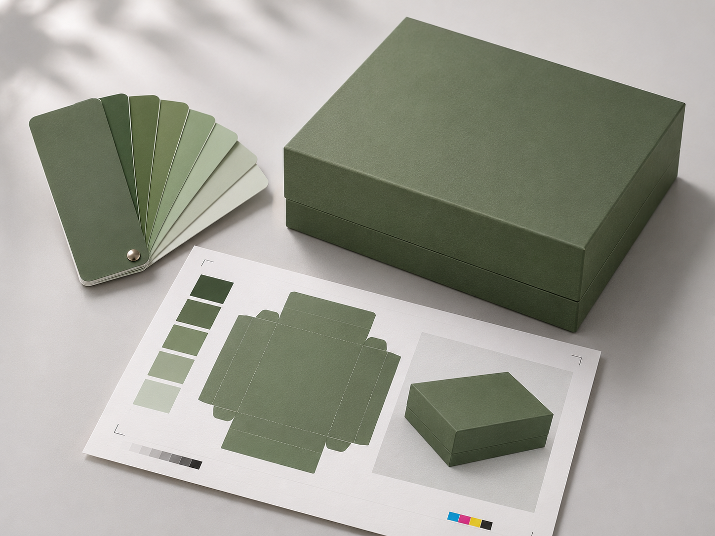
A Pantone number, printed proof, and finished packaging sample serve different purposes. Treating them as interchangeable can create disagreements during repeat-order approval.
We recommend maintaining three connected references.
1. Brand Color Reference
The brand color reference identifies the intended shade through a Pantone number, physical swatch, or defined color data.
Pantone provides a standardized reference system used in commercial printing. Its coated and uncoated references account for differences in how colors appear on their respective reference papers.
A brand specifying Pantone 5535 C, for example, communicates a particular dark green color target. However, its appearance on specialty wrapping paper may differ from the printed Pantone reference.
Keep these details together
- Complete Pantone reference, including its suffix
- Approved physical color reference
- Relevant color data, where available
- Intended packaging material and printing process
The Pantone reference establishes the intended color. Physical printing tests establish the appearance achievable on the selected material.
2. Approved Production Sample
An approved production sample demonstrates how the color reproduces under the intended manufacturing specifications.
It should reflect the selected substrate, ink system, printing process, and finishing requirements whenever practical. The ISO 12647-7:2016 standard establishes requirements for digital proofing systems that simulate defined printing conditions. A proof produced on ordinary coated paper may help assess color direction, but it cannot fully represent textured wrapping paper with matte lamination.
Production-representative samples are particularly useful when the selected color falls outside the achievable gamut of the printing process or when specialty materials affect the result.
The accepted physical sample becomes a practical reference for future production using the same approved specifications.
3. Finished Packaging Reference
The completed packaging provides information that a flat printed proof cannot fully demonstrate.
Rigid boxes involve printing, wrapping, adhesive application, and assembly. Folding cartons can involve coating, lamination, creasing, and folding. These operations may influence the visual appearance of the completed product.
We recommend reviewing the finished packaging for three characteristics.
- Color appearance across exterior panels and components
- Surface consistency after lamination, coating, or decorative finishing
- Component matching between lids, bases, sleeves, and other printed elements
The approved finished sample should remain identified by product version and approval date. This helps prevent outdated references from being used after a packaging specification has changed.
Pantone Spot Colors and CMYK Printing for Repeat Orders
The printing method influences how packaging colors are reproduced and controlled.
Pantone spot-color printing uses a separately formulated ink to produce a specified shade. CMYK printing combines cyan, magenta, yellow, and black through halftone reproduction to create a range of colors. Pantone's Color Bridge guides compare spot colors with their closest CMYK simulations, illustrating the differences between the two reproduction methods.
Both methods can achieve consistent results when the production conditions are suitable and controlled.
When Spot Colors Are Worth Specifying
Spot-color printing is often suitable for packaging with one or two distinctive brand colors, especially when they cover large areas.
A luxury fragrance box with a solid dark green exterior may benefit from a dedicated spot color. This allows the manufacturer to manage the selected shade through its ink formulation and printing conditions.
Spot colors are also useful when a brand requires a highly saturated shade that conventional CMYK printing cannot accurately reproduce on the intended substrate.
However, a Pantone ink specification alone does not guarantee identical finished packaging. Changes in paper, ink film characteristics, or finishing materials can still produce visible differences.
When CMYK Printing Is Suitable
CMYK printing is commonly used for packaging with photography, illustrations, gradients, and detailed multicolor artwork.
Repeat-order consistency depends on maintaining suitable color profiles, calibrated printing conditions, and approved production references. A change in substrate may require a revised color conversion or printing adjustment.
Some packaging designs benefit from combining CMYK printing with an additional spot color. This can support photographic artwork while giving a signature brand color its own ink specification.
The decision should account for the entire design, production cost, printing equipment, and expected repeat-order requirements.
How Packaging Materials Affect Color Matching
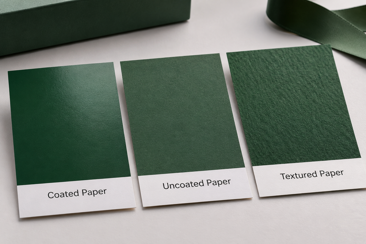
Paper characteristics influence ink absorption, light reflection, color saturation, and the final printed appearance. Fogra's paper testing methods examine properties such as whiteness, gloss, and surface characteristics, providing a technical basis for assessing substrate suitability.
A color approved on one substrate may look different on another, even when the same nominal ink is used. This is particularly relevant to packaging programs that combine rigid boxes, folding cartons, and paper bags.
Coated and Uncoated Papers
Coated papers generally provide smoother printing surfaces that can support sharp details and controlled ink placement. Uncoated papers are typically more absorbent, which can influence ink penetration and color saturation.
The difference depends on the specific paper grade and printing process. Two coated materials can still produce different results because their coatings, brightness, and surface characteristics are different.
Check these properties before approving a replacement paper
- Paper shade and brightness
- Coating type and surface finish
- Ink absorption characteristics
- Texture and surface uniformity
- Compatibility with the approved printing and finishing process
A replacement paper with the same grammage does not necessarily have the same printing characteristics. Material substitutions should be assessed against the approved color reference.
Specialty Wrapping Papers for Rigid Boxes
Luxury rigid boxes commonly use printed wrapping paper applied over thick paperboard. This construction supports decorative textures, specialty finishes, and substantial box structures.
The wrapping paper affects color reproduction through its surface texture, shade, and ink absorption. Dark-colored papers and strongly textured materials may require particular attention during sampling.
The approved paper specification should remain connected to the production reference. If a supplier proposes a replacement material, we recommend reviewing its printed appearance before accepting the change for a recurring order.
Folding Cartons and Corrugated Packaging
Folding cartons are commonly printed directly onto paperboard. Corrugated packaging may use direct printing or a separately printed liner attached to the corrugated structure.
These formats can involve different printing processes and surface characteristics. A coated folding carton, for example, may reproduce detailed graphics differently from a printed corrugated liner.
A packaging collection should therefore have material-specific production references while maintaining a coordinated overall appearance.
How Surface Finishing Changes Printed Colors
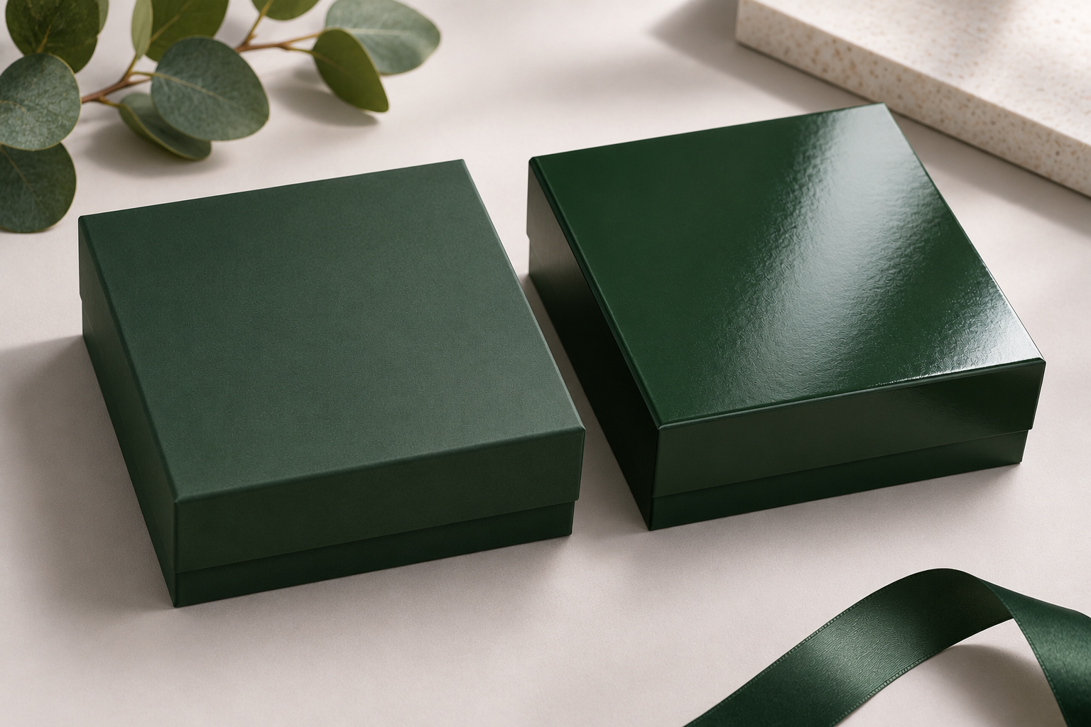
Lamination, coatings, and decorative treatments influence how light interacts with the printed surface. These finishing choices can affect perceived color depth, gloss, and contrast.
The approved print should be evaluated with its intended finishing treatment whenever the finished appearance is important.
Matte and Gloss Lamination
Gloss lamination creates a more reflective surface and can increase the perceived richness of certain printed colors. Matte lamination reduces specular reflections and produces a softer visual appearance.
The difference becomes particularly noticeable on dark or highly saturated packaging. A navy printed sheet may look different after matte lamination, even when the underlying ink remains unchanged.
Recommended approval sequence
- Review the printed sample on the selected substrate.
- Apply the intended lamination or coating.
- Compare the finished sample with the approved color reference.
- Approve the result before confirming the production specification.
The final reference should reflect the actual material and finishing combination intended for manufacturing.
Soft-Touch Coatings and Textured Finishes
Soft-touch finishes are commonly used in premium cosmetics, fragrance, and gift packaging. Their texture and surface appearance contribute to the presentation of the box.
Different films or coating formulations may influence gloss and perceived color. A change in finishing material can therefore affect the appearance even when the printed substrate closely matches the original.
Retaining the approved finishing specification helps reduce this source of variation in subsequent manufacturing orders.
Metallic Foil and Decorative Effects
Metallic foil behaves differently from ordinary printed ink because its appearance depends strongly on reflection and viewing angle.
Conventional color measurements may not fully describe the visual characteristics of metallic or highly reflective materials. Visual inspection under suitable lighting remains important.
Foil shade, stamping coverage, placement, and surface appearance should be reviewed separately from printed background colors. This is particularly useful when different packaging components share the same metallic decoration.
Measuring Packaging Color Differences With Delta E
Visual comparison helps determine how finished packaging appears, while instrumental measurement provides quantitative information about color variation.
A spectrophotometer can measure printed samples under defined conditions. The resulting color data can be compared with an approved reference using a color difference calculation.
What Delta E Means
Delta E expresses the calculated difference between two colors. It can be used to compare a production sample with an approved target.
CIE Lab* color values describe lightness and two color-opponent dimensions. Delta E calculations use this information to quantify differences between samples.
Several formulas exist, including CIE76 and CIEDE2000. They can produce different numerical results for the same pair of colors.
A useful Delta E specification should identify
- The approved target used for comparison
- The formula such as ΔE00
- The measurement conditions including relevant instrument settings
- The measurement locations on the packaging
- The acceptance tolerance agreed upon for production
The CIEDE2000 color-difference formula, defined in ISO/CIE 11664-6:2022, accounts for important characteristics of human color perception and is widely used in color evaluation workflows.
What Delta E Tolerance Is Acceptable for Packaging?
There is no universal Delta E tolerance that applies to every packaging material and printing process.
A solid brand color on a smooth coated paper may support tighter control than a similar color printed on a highly textured material. Metallic finishes and reflective coatings introduce additional evaluation challenges.
The acceptable tolerance should reflect the approved sample, production capability, measurement method, and importance of the color to the packaging design. The ISO 13655:2017 standard defines procedures for spectral measurements and colorimetric calculations in graphic arts, supporting consistent evaluation of printed color differences.
Example of how tolerances should be specified
Instead of stating only that packaging must match Pantone 5535 C, the manufacturing brief should identify the approved finished sample, measurement formula, instrument conditions, and agreed tolerance.
This gives both the manufacturer and purchasing team a defined basis for evaluating the production result.
Why Lighting Conditions Affect Color Approval
Printed colors can appear different under daylight, warm office lighting, and retail illumination.
ISO 3664:2025 establishes standardized viewing conditions for evaluating printed materials. ISO 13655 addresses spectral measurement and colorimetric calculations relevant to printed materials. Together, these standards provide a technical basis for comparing packaging colors under controlled conditions.
Measurement conditions are especially important when printed papers contain optical brightening agents, since instrument settings can influence the recorded results. Fogra's research on LED lighting and color evaluation examines how reduced ultraviolet radiation in modern lighting affects the appearance of printed papers containing optical brighteners.
We recommend assessing critical packaging colors under standardized lighting and checking their appearance under intended retail lighting when relevant.
A Color Continuity Record for Repeat Packaging Orders
An approved sample becomes more useful when its manufacturing specifications are preserved alongside it.
We recommend maintaining a Color Continuity Record, a proposed documentation framework that connects color references, production materials, approved settings, and quality control results across recurring orders.
Its purpose is to make previous approval decisions traceable and provide a consistent starting point for future manufacturing.
What the Record Should Include
The record should be updated whenever a specification change is approved. Previous versions should remain identifiable so production teams can determine which reference applies to a particular batch.
Why Physical Reference Samples Need Proper Storage
Printed samples can change appearance over time because of light exposure, humidity, temperature, and material aging.
A reference stored in unsuitable conditions may become less reliable for future color comparisons. Protecting samples from unnecessary exposure helps preserve their usefulness, while recorded measurements provide additional information when evaluating older references.
The sample should also be labeled clearly. Product identification, material specification, approval date, and production version help prevent confusion when multiple packaging designs share similar colors.
Repeat-Order Records Also Help Procurement Teams
Packaging programs often continue for several years. Purchasing responsibilities, production contacts, and product specifications can change during that period.
A documented reference allows a new procurement manager to identify the approved manufacturing requirements without reconstructing earlier decisions from separate artwork files or communications.
This is particularly useful when a company manages several product lines, recurring seasonal launches, or replenishment orders involving multiple packaging formats.
Quality Control During Repeat Packaging Production
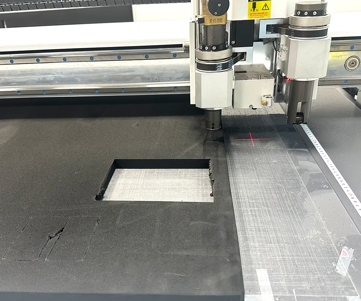
Color matching should be reviewed throughout manufacturing. An approved sample establishes the target, while production checks assess how closely the current batch follows that reference. PRINTING United Alliance's guidance on maintaining a G7 print condition explains how ongoing calibration and measurements help maintain consistent printing conditions over time.
A practical control process can be divided into five stages.
1. Confirm the Previous Production Specifications
The production team reviews the approved artwork, material, ink references, printing method, and finishing requirements.
Any approved changes since the previous order should be identified before manufacturing begins. This prevents outdated files or materials from being used for a newer packaging version.
2. Inspect Incoming Materials
Paper and finishing materials are checked against the intended manufacturing specifications.
Particular attention should be given to paper shade, coating characteristics, surface condition, and material grade. Changes that could affect color reproduction may require further sampling.
3. Approve the Initial Printed Output
Initial production sheets are compared against the approved reference after the printing process reaches suitable operating conditions.
Checks may include visual comparison, instrumental color measurement, and evaluation of printing consistency. Large solid-color areas may benefit from measurements at several locations.
4. Monitor Color During Production
Color should be checked at suitable intervals throughout the run.
The inspection frequency depends on the printing process, order quantity, criticality of the color, and established quality control plan. Results and corrective adjustments should be recorded where appropriate.
Representative samples from different production stages can provide useful evidence if variation is identified later.
5. Inspect Finished Packaging
Final inspection assesses the completed product after printing, finishing, and assembly.
Pay particular attention to
- Color differences between the lid and base
- Uneven appearance across large exterior panels
- Changes caused by lamination or coating
- Decorative finish consistency
- Visible differences between representative boxes in the batch
This final check connects printing measurements with the appearance of the actual packaging supplied to customers.
Matching Brand Colors Across Multiple Packaging Formats
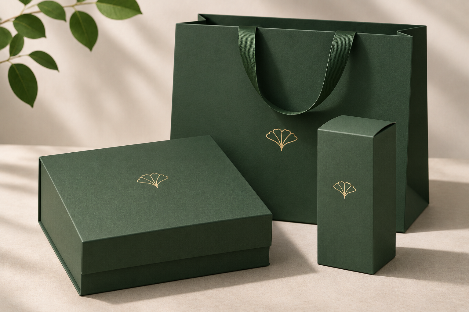
A product collection may use the same signature color across rigid boxes, folding cartons, paper bags, printed inserts, and corrugated packaging.
Each product can require a different substrate and printing process. Achieving a coordinated appearance involves establishing suitable references for the individual materials and evaluating the components together. Fogra's ProcessStandard Flexo provides an example of process-specific color control, using defined targets and tolerances to support consistent reproduction in flexographic packaging printing.
Coordinating Color Across a Packaging Collection
Consider a hypothetical fragrance collection with three packaging components.
- Rigid gift box using printed specialty wrapping paper with matte lamination
- Folding carton using coated paperboard with offset printing
- Shopping bag using a different paper grade with its own surface characteristics
The collection uses the same deep burgundy brand color. However, the ink specifications and printing conditions may need to differ across the three materials.
The goal is a recognizable visual relationship between the products, supported by achievable color targets for each manufacturing process.
We recommend approving coordinated samples when the packaging components will be displayed or used together.
Matching Approved Color or Existing Inventory
A repeat order may need to match the original approved production reference or packaging already in circulation.
These targets can differ if existing inventory has changed appearance during storage or retail display.
The comparison target should be established before production.
- Original approved reference supports consistency with the established manufacturing specification.
- Representative existing inventory helps evaluate how new packaging will appear beside stock already in circulation.
- Current brand color standard may take priority if the company has formally updated its visual identity.
A purchasing team should identify any conflict between these references before approving the replacement order.
When a Repeat Order Requires a New Color Proof
Repeat orders using unchanged specifications may be managed through retained references and normal production verification.
Changes to materials, printing methods, artwork, or surface finishing can require additional sampling. The decision should reflect the potential effect on the finished appearance.
Material Substitutions Deserve Particular Attention
Suppliers may propose alternative materials because of availability, pricing, or production requirements.
Two papers with similar thickness and weight may have different printing characteristics. Their surface coating, shade, or absorbency can influence color even when the ink specification remains unchanged.
A proposed substitution should be reviewed against the intended finished appearance. This allows the purchasing team to assess its impact before approving mass production.
Artwork Updates Can Affect Existing Color Specifications
Minor artwork changes may involve ingredient information, product instructions, or regulatory text while leaving the visual design largely unchanged.
However, revised files can contain changes to color profiles, linked graphics, transparency settings, or output specifications. These differences may affect the printed result.
Updated files should therefore be checked against the previously approved print requirements. Unchanged brand-color elements should retain their intended specifications unless a revision has been approved.
Diagnosing Color Differences Between Packaging Batches
Color problems are easier to investigate when the visible difference is connected to its possible production source.
A uniform change across the entire box may have a different cause from a variation limited to one panel or finishing component.
Separate Ink Differences From Finishing Differences
Two packages may have similar printed color measurements while appearing different because their surfaces reflect light differently.
This is particularly relevant for dark rigid boxes and packaging with soft-touch or specialty finishes. The appropriate correction may involve the finishing material instead of adjusting the printing ink.
Comparing the printed sheet with the finished box helps identify where the difference originated.
Compare Samples Under Consistent Conditions
The original and replacement samples should be viewed under comparable lighting, against suitable surroundings, and at consistent observation angles.
Instrumental comparisons should also use compatible measurement settings. Recorded results need to identify the reference, conditions, and calculation method used.
These controls help distinguish genuine production variation from differences caused by the inspection environment.
How Color Matching Affects Production Cost and Lead Time
Color matching requirements influence proofing work, production setup, quality control, and material selection.
Orders using established specifications may require fewer additional approvals than projects involving new substrates, revised colors, or specialty finishing changes.
Three cost considerations deserve attention.
Sampling and proofing
A simple ink drawdown has different production requirements from a complete rigid box sample. Additional proofing may be appropriate when color specifications are particularly demanding or manufacturing materials have changed.
Production controls
Tighter color tolerances can require additional measurement, inspection, or production adjustments. Their practical feasibility should be discussed before manufacturing begins.
Specification changes
A new paper grade, finishing material, or printing process may require further approval. These activities should be reflected in the planned manufacturing schedule.
The purchasing decision should consider the cost of color control alongside the potential impact of rejected packaging, inconsistent retail presentation, or repeat production.
Preparing a Color Matching Brief for a Packaging Manufacturer
A useful manufacturing brief connects the intended appearance with the specifications required to reproduce it.
The purchasing team should provide the previous production reference and identify any changes since the last approved order.
Repeat-Order Color Matching Checklist
Approved references
- Pantone numbers and relevant color data
- Approved physical sample
- Previous order reference
- Current artwork version
Materials and printing
- Paper grade and surface characteristics
- Approved ink and printing method
- Lamination or coating specification
- Foil stamping and decorative finishes
Color approval
- Measurement method and agreed tolerance
- Defined visual comparison conditions
- Reference for existing inventory, if applicable
- Sampling requirements for proposed changes
Production requirements
- Order quantity and packaging variations
- Required production and delivery schedule
- Shipping destination
- Special retail presentation requirements
Physical samples are particularly useful when packaging includes distinctive brand colors, textured materials, or finishing treatments that affect color appearance.
A clear brief also allows the manufacturer to identify changes requiring further testing before the order enters production.
Conclusion
Consistent packaging color across repeat orders depends on maintaining a reliable relationship between the intended brand color, approved manufacturing reference, and finished packaging.
Pantone specifications, physical samples, controlled materials, color measurements, and production QC each support a different part of that process. Their effectiveness increases when the approved information remains traceable across future orders.
At GUKA Packaging, we manufacture custom rigid boxes, folding cartons, corrugated packaging, and other branded packaging formats. We support recurring production through approved samples, material specifications, printing controls, and quality checks.
Planning a repeat packaging order? Request a custom packaging quote from GUKA Packaging. Share your approved sample, Pantone references, material requirements, estimated quantity, and delivery specifications so our team can review the manufacturing requirements.
Frequently Asked Questions
Can a packaging manufacturer match the exact color from a previous order?
Yes. Packaging manufacturers can closely reproduce previously approved colors using retained production samples, Pantone references, consistent materials, and controlled printing conditions. The achievable match depends on the substrate, ink system, and finishing specifications. Small variations may still occur between batches, so manufacturers should establish measurable color tolerances before production.
Why does the same Pantone color look different on packaging?
The same Pantone color can appear different because paper brightness, coating, texture, and ink absorption affect how the printed color is reproduced. Lamination and lighting conditions can also change its perceived appearance. A color printed on coated folding carton stock, for example, may look different from the same color printed on uncoated rigid box wrapping paper.
What is a good Delta E tolerance for custom packaging?
An acceptable Delta E tolerance depends on the packaging material, printing method, and brand's color requirements. Premium packaging with large solid-color areas may require tighter control than packaging with complex artwork. The manufacturer and buyer should agree on a tolerance, measurement formula such as ΔE00, and approved reference sample before production.
Do repeat packaging orders need new samples?
Repeat orders generally require new samples when paper materials, artwork, ink specifications, printing methods, or finishing treatments change. Orders using identical approved specifications may proceed with retained references and standard production checks. Additional sampling is advisable when new packaging must closely match existing inventory displayed alongside it.
Can the same color be printed on rigid boxes and folding cartons?
Yes. Rigid boxes and folding cartons can reproduce the same brand color, although their different substrates and manufacturing processes may require separate printing specifications. Rigid boxes typically use printed wrapping paper, while folding cartons are printed directly onto paperboard. Approving physical samples of both formats helps achieve a coordinated appearance across the packaging collection.
Does matte lamination change printed packaging colors?
Yes. Matte lamination reduces surface reflections and can change the perceived depth, saturation, and contrast of printed colors. The difference is often more noticeable on dark or highly saturated packaging. Color approval should therefore be based on a sample with the intended matte finish, since an unlaminated proof may look different from the completed box.
What causes color differences between packaging batches?
Common causes include changes in paper shade, ink formulation, printing conditions, substrate coatings, and finishing materials. Equipment calibration and differences in inspection lighting can also affect color consistency. Comparing production samples with an approved physical reference helps identify the variation, while material records and color measurements help determine its likely source.
How should packaging colors be approved before mass production?
Packaging colors should be approved using a physical sample produced with the intended substrate, printing method, and finishing specifications. The manufacturer and buyer should confirm the color reference, acceptable tolerance, and viewing conditions. The approved sample should then be retained as the reference for production inspection and future repeat orders.
What should be included in a repeat-order color matching brief?
A repeat-order brief should include the approved physical sample, Pantone references, final artwork version, paper specifications, printing method, and finishing requirements. Buyers should also provide previous order details, agreed color tolerances, and any material changes. Existing packaging samples are particularly useful when the replacement batch must match products already in circulation.
How can packaging color consistency be maintained across multiple orders?
Consistent results depend on retaining approved samples, documenting printing and material specifications, and controlling changes between production runs. Manufacturers should inspect incoming substrates, verify initial printed output, monitor color during production, and review completed packaging after finishing. Recording approved changes and quality control results also provides reliable references for subsequent orders.
Recommended for you








You Might Enjoy



Are we right for each other?
We work best with brands that treat packaging as part of the product, not as the last thing on the list. To save us both time, here is who we work with best.
We're probably not the right fit if:
- Orders under $2,000.
- A few boxes, one time.
- Lowest quote wins.
- No conversation, just add-to-cart.
- Brand direction still up in the air. Our FAQ covers the basics first: process, scale, sampling, finishing, production. Worth reading before submitting anything.
We're a strong fit if:
- Projects starting around $2,000 and up.
- Sampling before production makes sense to you. It runs from $300, though complete artwork and locked specs can sometimes skip straight to the line.
- There's real budget behind the packaging, and an expectation that production standards get defined properly.
- What's needed is a manufacturing partner across structure, material, process and delivery. Not a print shop taking a file.
- The box has a job: retail shelf, gifting, unboxing. It has to carry the brand.
- Getting it right matters more than getting it cheapest.
Sound like your project? Let's talk

What happens after you submit
1. A specialist reviews your project, usually within 1 business day.
2. We follow up with questions, options, and indicative pricing.
3. Once the spec is confirmed, we move to sampling.